
Resume Format Guide: Choose the Right Structure
Compare chronological, functional, and combination formats—and choose a readable page setup.
Reviewed by the BuildMyCV Editorial Team for document usability, print reliability, ATS-conscious structure, and international page-format differences.
Recommendations are based on conventional recruitment reading patterns, common employer file instructions, selectable-text PDF behavior, and testing with BuildMyCV’s one-page and two-page templates. No claim is made that one format works in every applicant tracking system.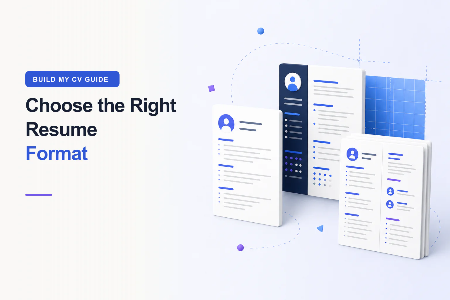
Resume format is the information architecture of your application. The best format makes dates, progression, relevant evidence, and contact details easy to locate without forcing the reader to decode an unusual design. This guide explains the trade-offs rather than declaring one layout universally correct.
The best default: reverse chronological
Reverse chronological resumes lead with your recent experience and move backward in time. Recruiters can quickly see progression, dates, and the context behind your skills. It is the strongest default for most people, including those changing industries but continuing to use transferable capabilities.
When a combination format helps
A combination resume opens with a concise skills or highlights section, then provides a normal dated work history. It can help career changers connect prior evidence to a new role, but the highlights must remain specific and the work history should not disappear.
Functional resumes that hide dates or employers often create more questions than they answer. If you have a gap, address the timeline honestly and keep the rest of the structure conventional.
BuildMyCV lets you edit beside a live CV preview and save privately in your browser.
Start building your CVOne page or two pages?
Choose length based on relevant evidence, not a universal rule. A one-page resume suits students, recent graduates, and many professionals with a focused history. Two pages can suit senior leaders, specialists, academics, and candidates whose recent accomplishments need more space.
Page setup and ATS considerations
Use a readable 10–12 point body size, clear headings, consistent dates, and moderate margins. A4 is standard in many countries; US Letter is common in the United States and Canada. Submit the file type requested by the employer.
Keep essential information in the main document flow. Simple columns can work, but a single-column template is the safest choice when you do not know how a system parses complex layouts.
Match format to the evidence you actually have
A format cannot compensate for missing evidence, but it can reveal or obscure what is present. Candidates with steady recent experience usually benefit from reverse chronology. Career changers may add a compact highlights section, while researchers and specialists may need clearly separated publications, projects, or credentials.
Choose the structure after reviewing the target role and your evidence bank. If a layout requires tiny text, unexplained gaps, or repeated claims to fill space, change the format rather than forcing the content.
Use columns with deliberate reading order
A narrow sidebar can hold skills or education, but essential experience should follow a clear top-to-bottom order. Contact information should remain in the main content and should not depend on icons alone. When an employer warns against columns, use a single-column version.
Test reading order by copying all text from the PDF into a plain-text editor. If sentences, headings, and dates arrive in a confusing sequence, choose a simpler template for that application.
Set typography for real reading conditions
Select a reliable family with distinct weights and readable punctuation. Body text around 10 to 12 points is a practical range for many fonts, while headings need enough contrast to establish hierarchy. Line height, paragraph width, and spacing matter as much as the nominal point size.
BuildMyCV allows global and field-specific typography. Use overrides sparingly: a different size for the name or headings can help, but multiple unrelated families, weights, and italics make the document harder to scan and less predictable in print.
Control page breaks instead of shrinking endlessly
If a one-page CV overflows, first remove repetition, shorten older roles, and tighten excessive spacing. Do not reduce body text until it becomes uncomfortable. A readable two-page document is more professional than a crowded page that hides useful evidence.
Keep a heading with the content that follows it and avoid splitting a short role across pages. Export, inspect, revise, and export again after substantial edits because a single line can change the pagination.
Choose and verify the final file type
PDF usually preserves layout and selectable text, but the vacancy instruction is authoritative. Some employers request DOCX or require every field to be entered in an online form. Never rename a file extension to imitate another format.
For PDF, confirm page size, margins, links, selectable text, and the absence of blank pages. Open the file in a second viewer when the application is important, because browser print engines and PDF viewers can display edge cases differently.
Format unusual career timelines honestly
Employment gaps, overlapping freelance assignments, parental leave, study periods, and portfolio careers do not require a deceptive layout. Use accurate dates, concise labels, and enough context to make the timeline understandable. A short career-break entry can be appropriate when it explains a substantial period and includes relevant development or responsibilities.
For contract work, decide whether separate engagements or one consultancy heading gives the clearest picture. Preserve client confidentiality and avoid implying employment where the relationship was different. A reader should understand both the type of work and the source of the evidence.
Adapt the format for different career stages
Students can lead with education, placements, projects, and relevant activities when professional history is limited. Mid-career applicants usually lead with recent experience. Senior leaders may need a compact executive profile followed by selected achievements, scope, and a clear two-page chronology.
Academic, medical, legal, and creative applications may follow field-specific conventions that differ from a general business CV. Consult the employer and professional body before removing publications, cases, clinical rotations, portfolios, or credentials that the field expects.
Final review checklist
- The target role is clear within the first third of the page.
- Recent bullets show actions, context, and useful outcomes.
- Dates, tense, punctuation, and links are consistent.
- Body text remains comfortable to read at 100% zoom.
- The exported PDF contains selectable text and clean page breaks.
Compare our ATS-friendly CV templates or open the free online CV builder.
Useful answers for this topic
Is a functional resume ever the best choice?+
A fully functional format that hides employers and dates often creates uncertainty. A combination format is usually clearer: lead with selected capabilities, then provide a normal dated history that shows where the evidence came from.
Which margins are safest for a professional CV?+
Moderate margins around 15 to 25 millimetres, or roughly 0.6 to 1 inch, work for many layouts. The right value depends on page size and content, but margins should never make the page feel cramped or risk printer clipping.
Should a CV use A4 or US Letter?+
Use A4 in most countries and US Letter when applying in the United States or where the employer requests it. If uncertain, follow local convention and inspect the exported document after switching sizes.
Are icons safe in a resume format?+
Icons can support visual scanning, but essential meaning should also appear as text. Do not rely on an envelope icon without the email address, and consider disabling decorative icons for conservative or parsing-sensitive applications.
Sources, review, and limitations
Recommendations are based on conventional recruitment reading patterns, common employer file instructions, selectable-text PDF behavior, and testing with BuildMyCV’s one-page and two-page templates. No claim is made that one format works in every applicant tracking system.
- The target employer’s application instructions
- A4 and US Letter page standards
- Current recruitment guidance from relevant professional bodies
BuildMyCV publishes practical educational guidance, not hiring guarantees or individualized legal advice. Employer instructions and current local requirements take priority.