
How to Customise Your CV Design Without Losing Clarity
Customise CV fonts, sizes, weights, spacing, colours, photo crops, and individual fields while preserving readability and professional hierarchy.
Reviewed by the BuildMyCV Editorial Team through screen, print-preview, and PDF checks across the current template and typography controls.
Recommendations were tested by changing global and field-specific design settings across one-page, two-page, photo, and no-photo templates. The review prioritised reading comfort, visible hierarchy, selectable text, and consistent output rather than subjective fashion claims.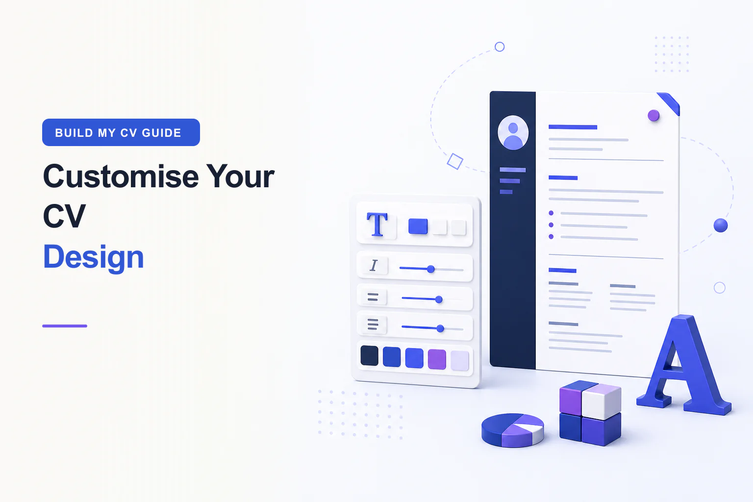
CV design customisation works best when every visual choice improves reading. This guide explains how to customise a CV template in BuildMyCV using font family, font size, weight, italic style, colour, spacing, page size, photo positioning, and field-level typography. It also shows how to preserve a clear information hierarchy, accessible contrast, ATS-conscious text, and reliable PDF output. The goal is a professional CV that feels personal without becoming decorative or difficult to scan.
Choose the template before fine-tuning styles
Begin with structure. Compare whether the CV needs one or two pages, a single main column or a supporting sidebar, and an optional photo area. Select the template that already places your strongest evidence in a natural reading order. Styling cannot rescue a structure that gives too much room to minor skills and too little to recent experience. Use the template filters to narrow the gallery, then preview real content rather than judging an empty sample.
Consider the context of use. A restrained chronological design suits many corporate, public-sector, technical, and regulated applications. A stronger accent or editorial heading can suit creative work when the portfolio and role support it. Photo expectations vary by market, so keep the upload optional. When an employer supplies a format or asks for a plain document, follow that instruction even if another template looks more distinctive.
Set a readable global font family
Use the global font family to create a consistent baseline across the document. BuildMyCV provides five choices with different character and proportions. Compare them using your longest employer names, technical terms, dates, and bullet points because a font that looks elegant in a heading may wrap inefficiently in body text. Familiar letter shapes, visible punctuation, and clear differences between regular and bold weights matter more than novelty.
BuildMyCV lets you edit beside a live CV preview and save privately in your browser.
Start building your CVBuild hierarchy with size and weight
Create a small, repeatable type scale. The name can be the largest element, followed by major section headings, job titles, and body copy. Dates and supporting metadata can be smaller, but they must remain legible. Start with a body size around the template default and change it only after reviewing the whole page. A nominal font size is not identical across families, so trust the rendered preview rather than assuming one number always reads the same.
Use font weight to signal structure: bold for names, section headings, employer or role labels; regular for sentences and bullets; medium or semibold where the chosen family supports it clearly. When everything is bold, nothing leads the eye. When every label is light, scanning becomes slow. Keep repeated fields consistent across all roles and education entries so the reader learns the hierarchy once and can move through the CV confidently.
Use italic style for short supporting details
Italic text can distinguish a company descriptor, publication title, degree detail, or short contextual note. Use it sparingly because long italic paragraphs are harder to scan on screen and in print. Never rely on italic alone to communicate essential status, such as a required qualification or an employment date. Combine wording, position, and consistent labels so the meaning remains clear when styling is removed or interpreted by assistive technology.
Customise individual CV fields consistently
BuildMyCV lets you override typography for a specific field, such as full name, professional title, contact details, summary, company, job title, dates, education, skills, and section content. Start from the global settings, enable an override only when the field has a distinct role, and reset it when the difference no longer helps. A targeted override should solve a clear issue: strengthen hierarchy, prevent an awkward wrap, or clarify secondary information.
Choose colour for contrast and reproduction
Use the accent colour for headings, rules, icons, or small structural areas rather than for long body paragraphs. Dark text on a white or very light background remains the safest reading combination. Check that coloured headings maintain strong contrast, especially when printed by an office printer or viewed on a lower-quality display. A pale fashionable colour may disappear in print even when it appears attractive on a bright screen.
Meaning should not depend on colour alone. A section heading needs wording and position, not merely a blue shade. Links should be recognisable from their text, and contact details should remain visible in grayscale. Preview the CV using the browser print dialog and, when colour is not central to the role, consider a grayscale check. One consistent accent normally creates a stronger identity than a collection of unrelated colours.
Balance spacing, page size, and content density
Whitespace separates ideas and gives headings room to work. Adjust section spacing and line height gradually while watching the full page. Crowded bullets, narrow leading, and tiny gaps can make a one-page CV feel longer than a calm two-page version. Conversely, excessive gaps can push a final line onto another page and disconnect related content. The best density lets a reader distinguish sections instantly without wasting space needed for relevant evidence.
Select A4 or US Letter according to the employer’s instruction and regional convention before final spacing. The shapes differ, so a line or page break may change when you switch. If the CV overflows, return to the content and remove repetition before reducing body size. Keep margins sufficient for printing and avoid placing critical text against the edge. Page-fit controls should support editorial judgment, not automatically compress every detail.
Crop an optional professional photo carefully
When a chosen template supports a photo and the application context makes it appropriate, upload a current, high-quality square or portrait image with an uncluttered background. Use the drag controls to move the image up, down, left, or right until the face and shoulders sit naturally within the frame. Check the crop in the full-page preview, because the small upload thumbnail may not reveal how the image balances with the name and heading.
Do not distort the photo, apply heavy filters, or let the face touch the edge. Export a no-photo version when local expectations, employer guidance, bias concerns, or personal preference make that safer. The underlying template should preserve alignment without the image. A photograph is not evidence of capability, and no candidate should feel required to add one simply because the design offers the option.
Test the customised CV before applying
Review the design at normal zoom on both a large and small screen. Confirm that heading levels are obvious, body text is comfortable, dates remain aligned, and no field override produces an isolated inconsistency. Switch to preview-only mode for an uninterrupted reading pass. If you notice the styling before the evidence, reduce the number of visual treatments. The strongest CV design supports content quietly and makes the next relevant fact easy to find.
Download the PDF and inspect every page. Search and select text to verify that custom typography has not converted content into images. Print or use a grayscale preview when the application may be reviewed on paper. Check links, page breaks, photo crop, and filename. Keep an exported design backup before experimenting further, and preserve a simpler alternative for employers whose portal instructions favour a conventional single-column document.
Final review checklist
- The target role is clear within the first third of the page.
- Recent bullets show actions, context, and useful outcomes.
- Dates, tense, punctuation, and links are consistent.
- Body text remains comfortable to read at 100% zoom.
- The exported PDF contains selectable text and clean page breaks.
Compare our ATS-friendly CV templates or open the free online CV builder.
Sources, review, and limitations
Recommendations were tested by changing global and field-specific design settings across one-page, two-page, photo, and no-photo templates. The review prioritised reading comfort, visible hierarchy, selectable text, and consistent output rather than subjective fashion claims.
- The current BuildMyCV Design tab and field-level typography controls
- WCAG guidance on text contrast and non-text-dependent meaning
- A4 and US Letter print previews from current mainstream browsers
BuildMyCV publishes practical educational guidance, not hiring guarantees or individualized legal advice. Employer instructions and current local requirements take priority.